


CAFERING ginza
Layers History Salon (積み重ねられた今までの歴史の礎を軸に新しいブランディングへの変化)
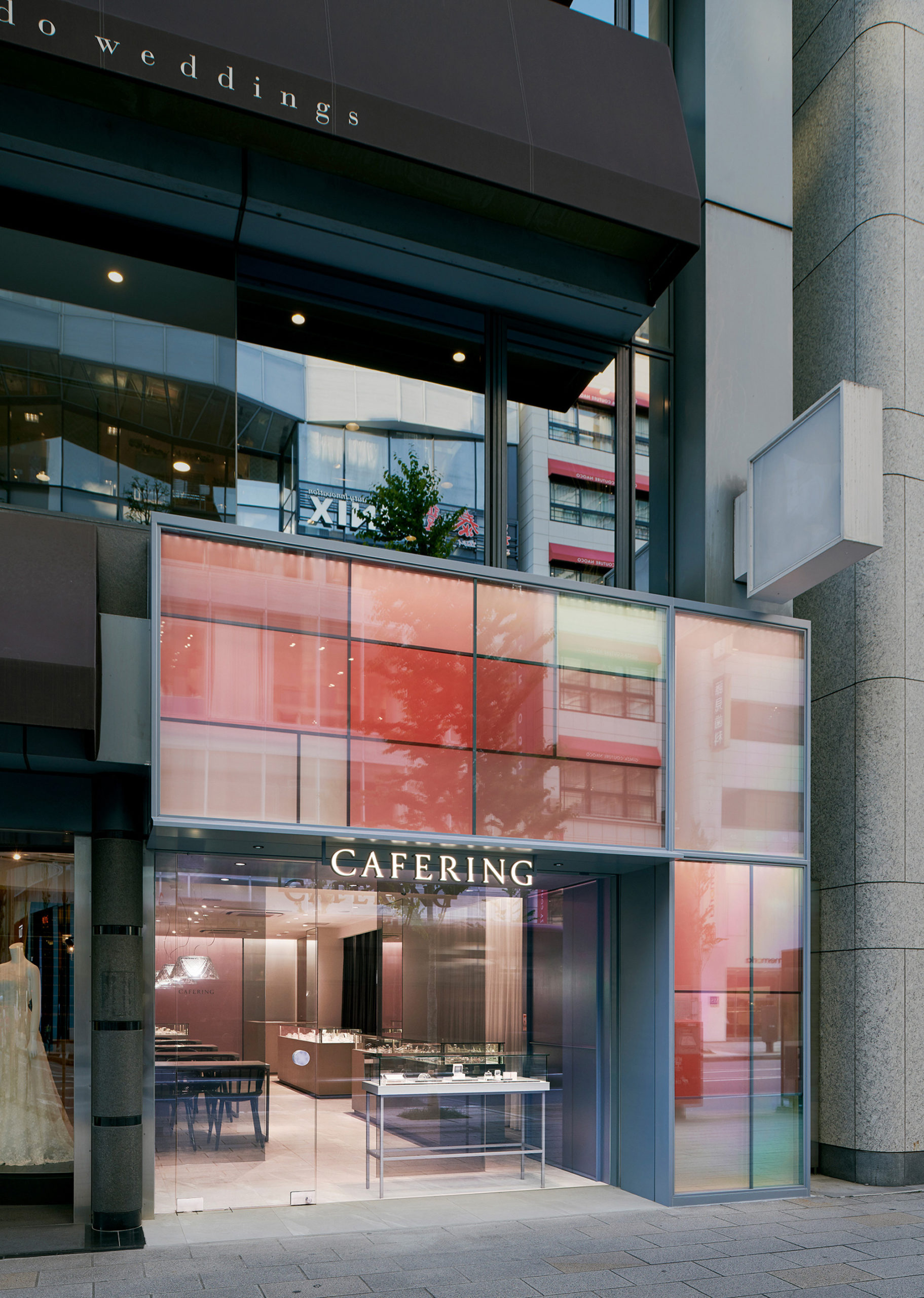
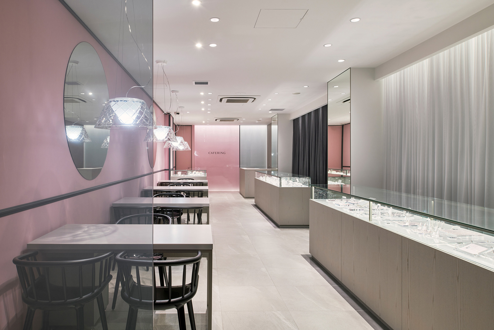
CAFERINGの新ブランディングの新店鋪デザイン。
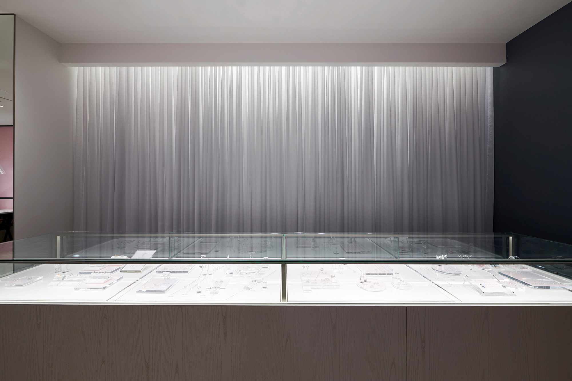
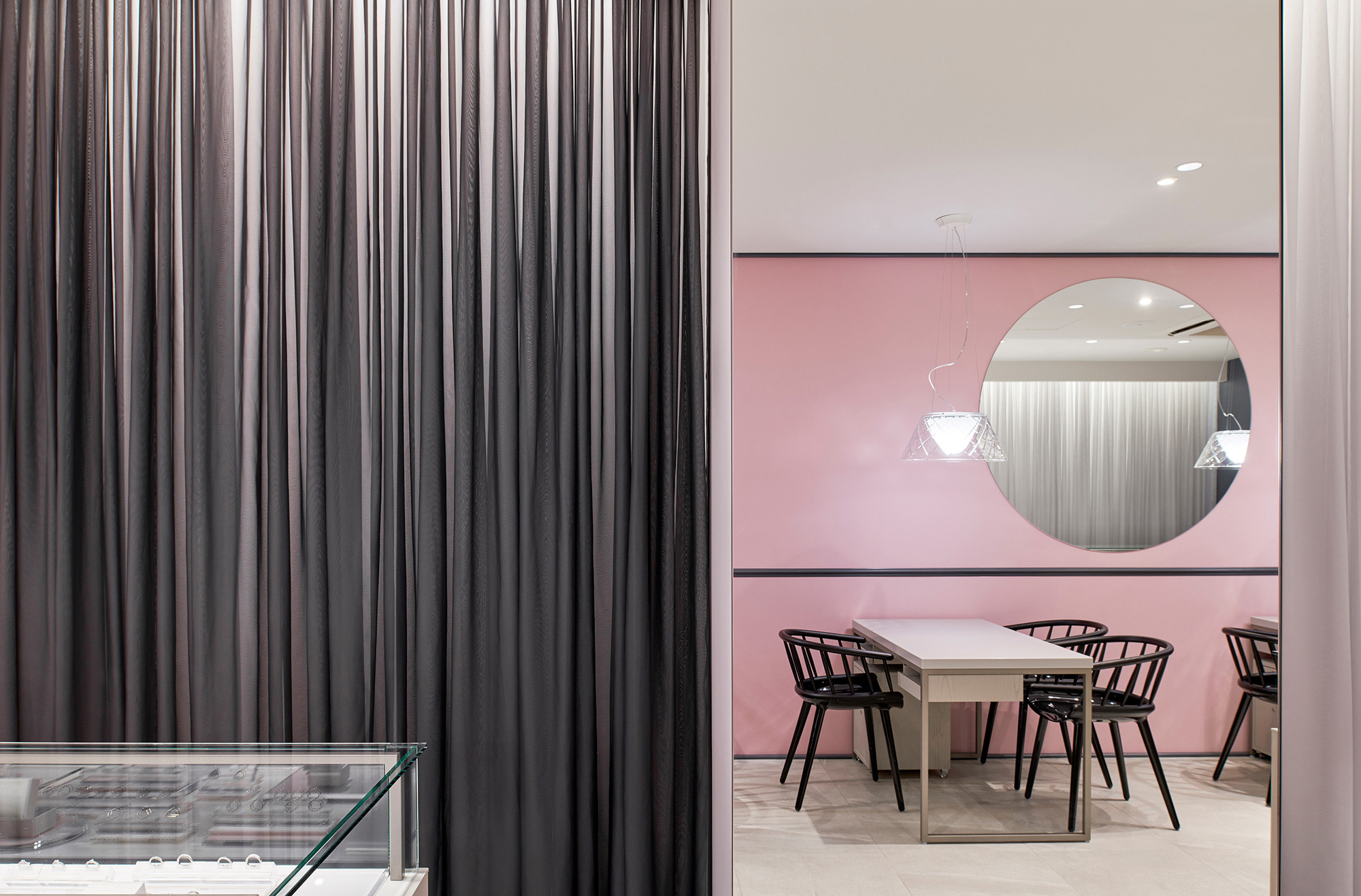
「大人可愛い」というコンセプトを軸に、ブランディングカラーの「PINK」「GRAY」を
各所に機能的ボリュームとしてアウトプットし、
利用者に対して新ブランディングの世界観がどの場所にいても体感出来るように意識した。
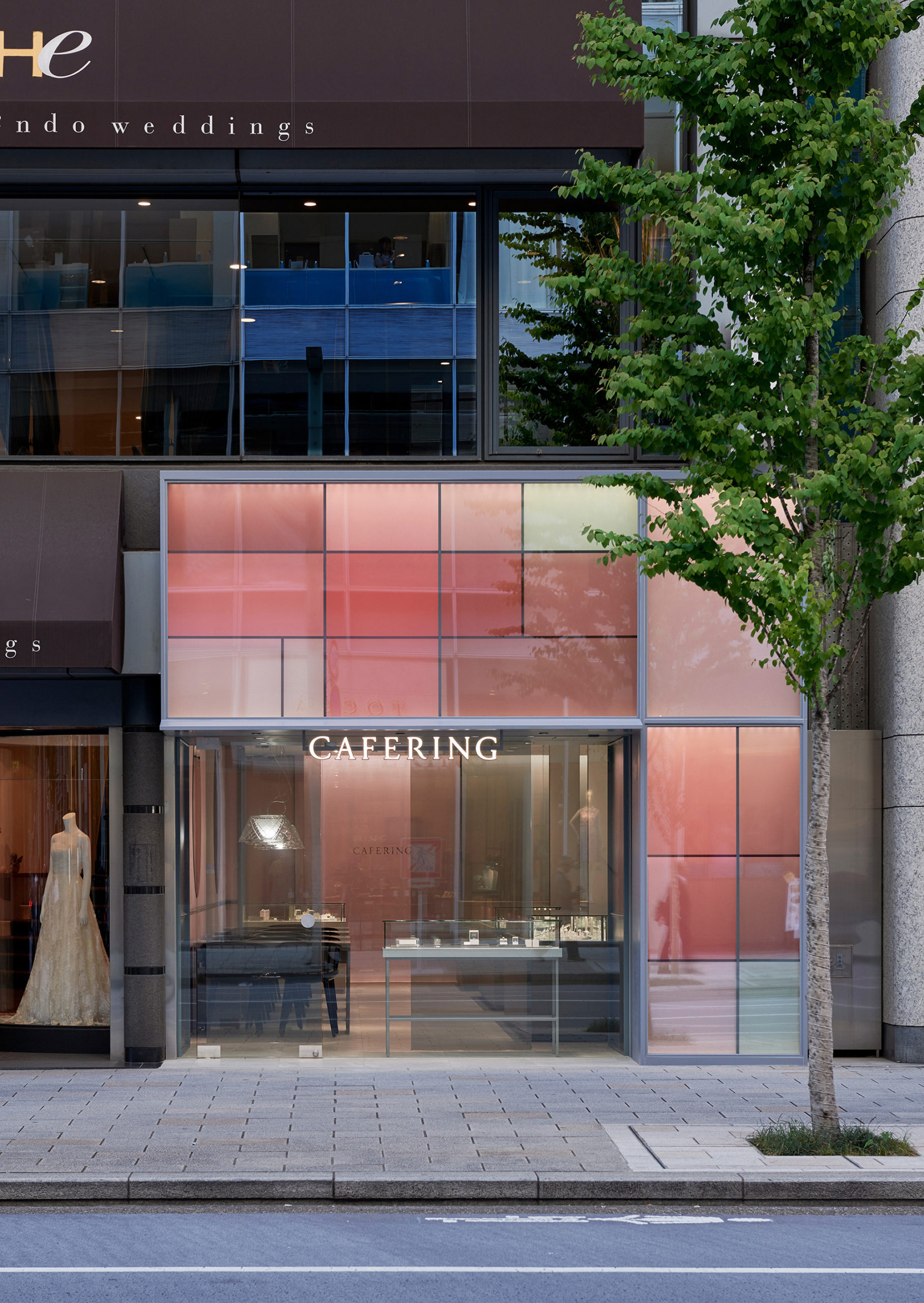
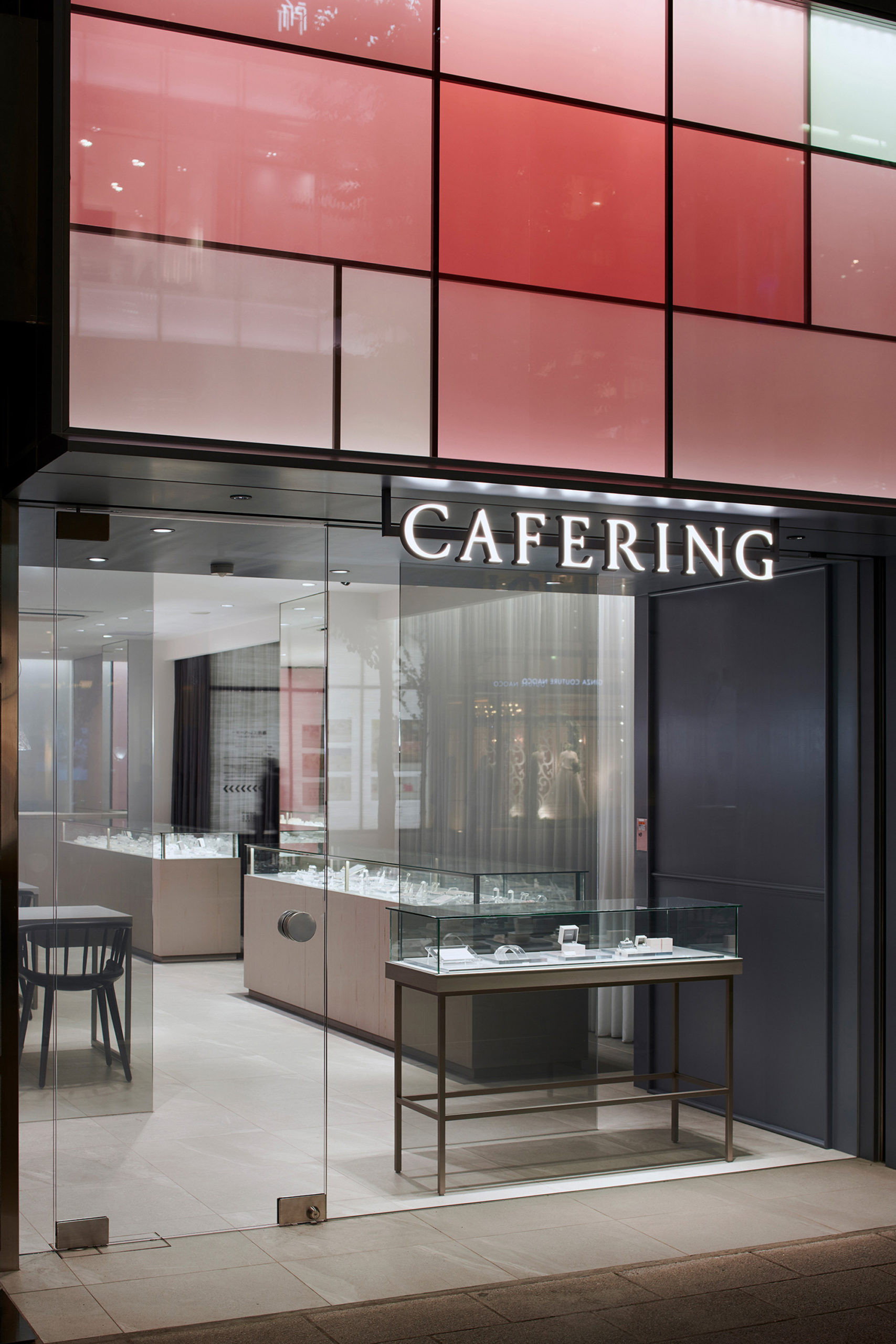
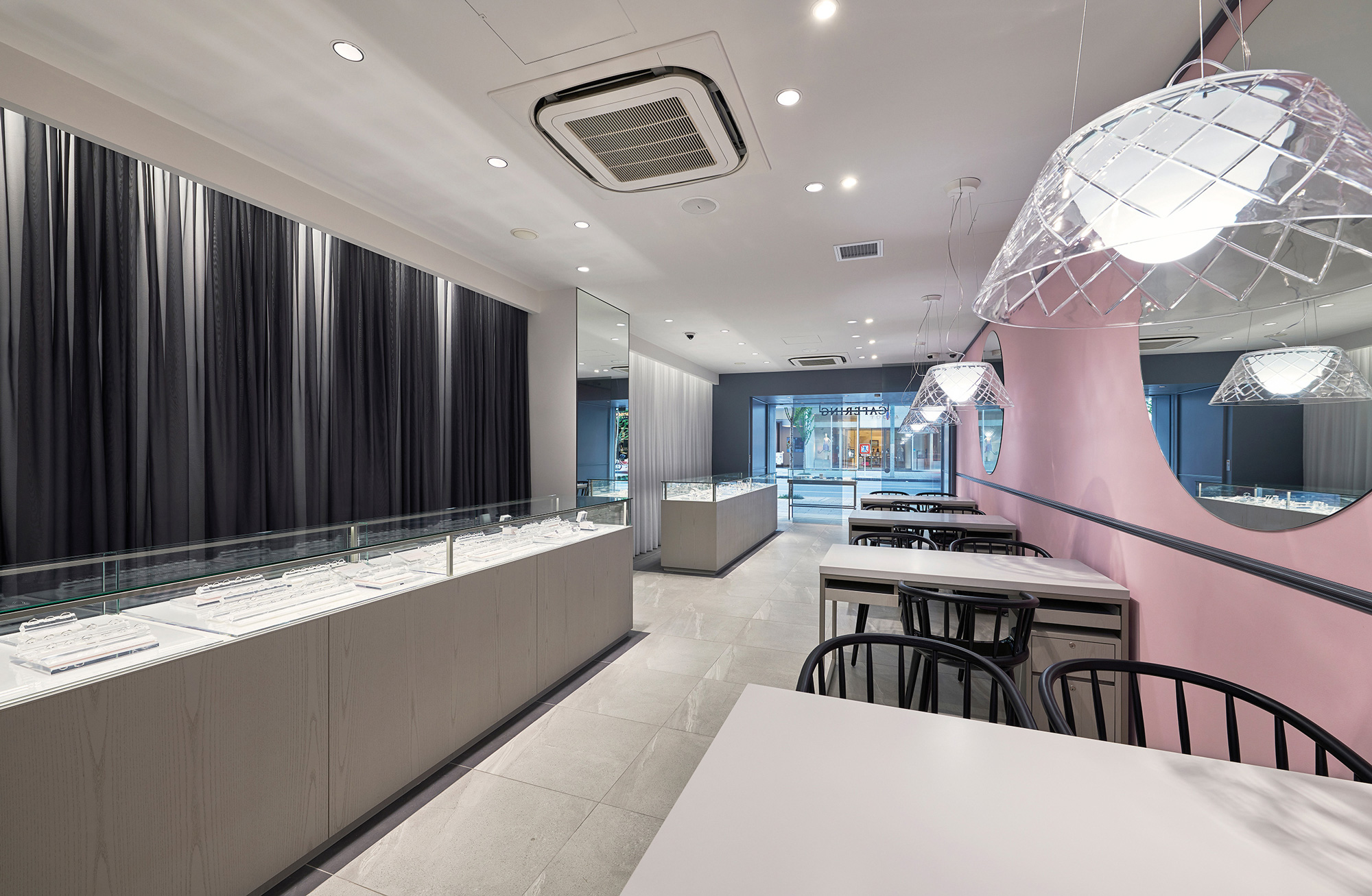
外部との境界にあたるファサードには、ブランディングカラーで作られたガラスパネルの連続オブジェクトを
4層のレイヤーで構成し、今までのCAFERINGの歩んできた歴史の礎の層から一新するイメージを表現する。
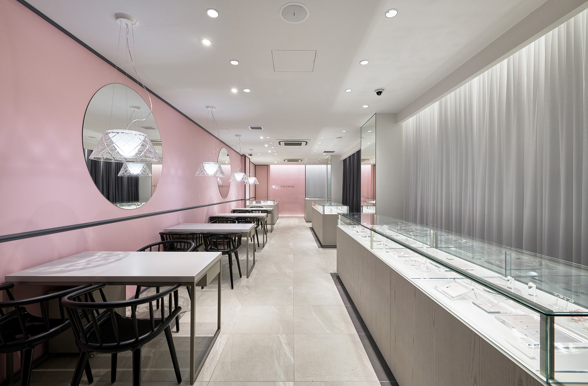
その下を通り空間内へ訪れる事で、柔らかさや可愛らしさと少しの緊張感の中に包まれながら
今まで培ってきた煌びやかな「美」に対する意識のこだわりを感じ取れる場所になればと考えた。
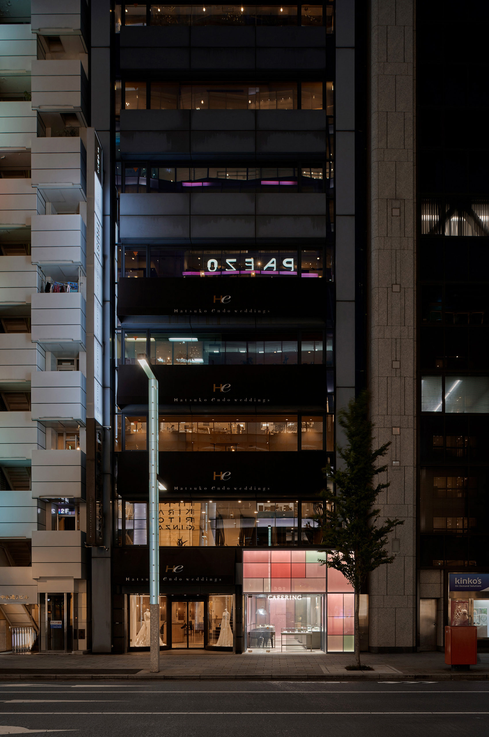
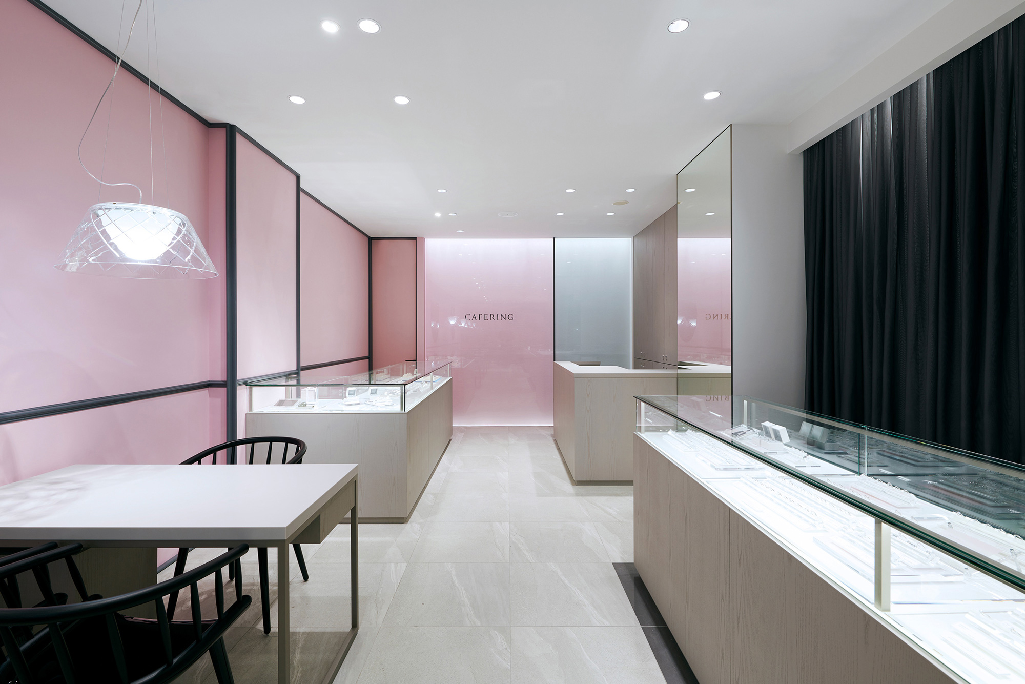
積み重ねられてきた20年の歴史の礎を守り、新たにブランドロゴ及びカラーを一新するという挑戦を実践する事で、
銀座という日本の中枢を担う場所に新しい「CAFERING」の独自の世界観が表現されればと思う。
Layers history salon (Change to Blanding who is new centering on a foundation of the accumulated conventional history)
New store design of new Blanding of CAFERING.
Centering on a concept “adult-cute”, I output “PINK” “GRAY” of the Blanding color for functional in each place and was conscious so that a view of the world of new Blanding sensed it bodily even if a user was in any place.
In the facade equal to the border with the outside, I constitute a series of glass panels object made with Blanding color in four levels of layers and express an new image to renovate from the layer of the foundation of the history that conventional CAFERING walked.
I hope that it was in the place that could to be a place where I could feel the consciousness of the gorgeous “beauty” that I have cultivated so far While wrapped in softness and cuteness and a little tension by entering the space through there.
By practicing the challenge of renewing the brand logo and color while protecting a foundation of the history of 20 years when it has been repeated.
I would like to see the new “CAFERING” unique worldview in Ginza, which plays a central role in Japan.
Type / jewelry shop
Place / 1F 1-7-5 ginza chuoku tokyo japan
Floor area / 66㎡
Complete /may.2019
Photo / takeshi asano
Lighting Design / NEW LGHIT POTTERY
Client URL / https://www.cafe-ring.com/